When considering colour in production and design it can be important to evoke a reaction out of the viewer, colours can effect your mood so as one can bring out one emotion so can it bring out the opposite due to culture, prior association, or even personal preference.
Colours–
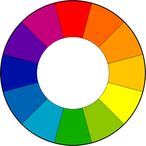
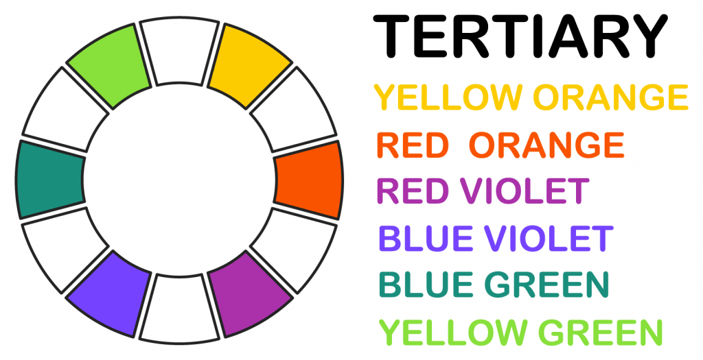
Using Primary and Secondary colour can allow you to experiment and find what suits best for your scene or photograph. The Primary colours are Blue, Red and yellow while the Secondary colours are Green, Violet and orange. As these are mainly the most used colours there are also tertiary colours that are made by combing a Primary colour with a Secondary colour. These colours can be a way to combine a scene together by allowing the surroundings affected to create a unique mood than what you would with maybe just using primary and secondary colours. These colours can consist of Yellow-Orange, Red-Orange, Blue-Violet, Blue-Green and Yellow-Green.
Neutral Tones
It’s not only Bright or Colourful colours that can provoke a emotion for a viewer it can also be caused by Neutral Colours. As well as the colour wheel the neutral tones can bring out a certain emotions when used in certain shots or scenes.
- Black – Creates a feeling of Power, Formality and can be linked to death, evil and can be seen as menacing if used in the right setting.
- Grey – Is seen as something modern or simple. It can often invoke a depressing or empty feeling towards the viewer as there is not much excitement in the tone.
- Brown – Can be linked to dirt, wood and the earth. Giving a grounding feeling when viewed.
- White – White can be seen as something that is pure, untouched and can be linked to being holy. If used in a scene it could capture the audience’s attention because of the way its colour can brighten up the whole room due to its bright nature when presented
Saturation
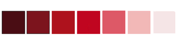
Saturation is determined by the combination of the lights intensity, Having a high saturation on a colour will transform it into a brighter shade or tone. However the darker the saturation the darker the shades can go as presented above.
Luminance
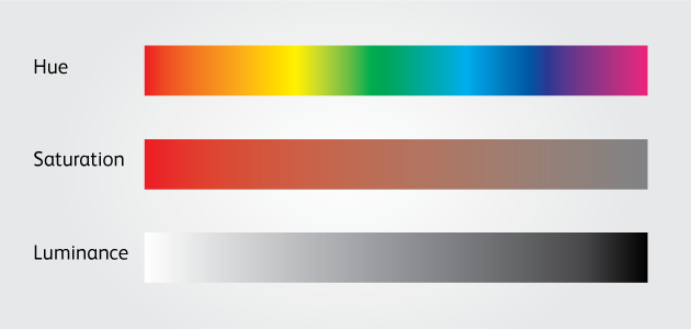
Luminance is the measurement of how you describe the brightness of a colour. Usually it the Black is represented as 0% but where as white is represented as 100% due to its bright in colour nature and this can be called Relative Luminance as its defined as the relative brightness of any point in a colour.
Tones shades and tints
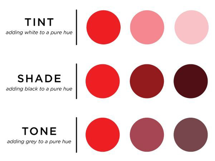
- Tones – adding grey to mute a hue
- Shades – adding black to darken a hue
- Tints – adding white to lighten a hue
Different Colour Techniques:
- Monochromatic – Tones, Shades and tints within a singe specific hue
- Analogues – Using colours next to one another on the colour wheel
- Split Complementary – Using colours that are opposite to one another
- Triadic – Using colours equally spaced around the colour wheel
- Tetradic – Four Colours evenly spaced around the colour wheel
- Custom – Does not follow any set of rules or patterns on the colour wheel.
Bibliography:
https://colourware.org/2012/03/02/why-i-dont-like-the-colour-wheel/
