Creating my five image and test shots I knew that I would be difficult to plan and shoot due to Covid restrictions. Although this problem arose I had the chance to do a shoot with my dogs. Because of restrictions I could not go back home to do my shooting, however there was a brief period when were allowed to go back in which I took my chance and tried to produce a photo shoot and hopefully more.
My idea for my five image’s were to photograph my dogs In a happy or good environment, this was to help put my message across that you should adopt rescue dogs rather ran breeders.
Another idea I had was to use the images I get and create a poster like image where I will include my DDM message, this is to help create my perspective on how a happy dog should look. Compared to my main video idea this would take on the happier side of the message, in which I want to present what changes you can make to a dogs life.
Dog Shots – Sam And Brodie
When photographing Brodie the challenge was being able to shoot him with full detail and focus, as the colour of his fur was black. Along with his colour I was lucky enough to get a sunny day but this was also problem as sunlight at times made him out to me more fluffier and bigger than normal. Also trying to keep his eyes in shot and not covered by any of his hair was a task.
Improved images
Out of all the shots I took these two were my favourite because I was able to capture his face clearly along with getting the right frame of focus. The part hat was an addition as it was soon his birthday but I also thought it could add a comedic element and engage the viewer more.
In the end these two came on top and I am pleased to go ahead and use one or both to use in my final images.
Sam –
Similar to Brodie, Sam was difficult to shoot but this time he would not stay sill. I had to bribe him with treats and even then it was hard to capture him in the best way. With the sunlight, It had helped a little bit as it brought out the white in his fur and also gave more contrast between him and the background. Not as much as brodie but Sam is still visible in most of the photos.
Although the moving about and not staying still was a pain, it had worked in my favour because it allowed me to shoot natural shots that are not as positioned or planned, it was more realistic and gave me the look I was going for.
What I liked most about my shots was the facial expression of them both, they both look that they are enjoying their life and having a good time. Compared to maybe shooting them at a different time such as when they are not so happy would produce a different narrative. As for my five images I did not want to go down this path as I was already doing that for my main promotional Image. With these images the narrative is more on the happier side and is what I was aiming for.
Field Shot
As for these shots my plan was not to shoot on that day as in I was only shooting the dogs but the more I thought about looking back at these shot were that I could be a good use for the poster style image. I wanted to include my DDM – Dog Deserve More title and to include some other text to go along with it. I thought to add a image of my dogs somewhere on their but using the photos I took I did not think that It would work well as another mean of imagery.
Image development
For the development of my images I started off with the image of the field. As I stated before I wanted to include my message and add some meaning to my image.
Creating this I used my second field image because to me is was the best presented and had a clear and easy look to it.
I only used one Image found from the web at it was a free outlining of a dog, this was a good suit for my image poster as I wanted to keep it simple and clear. To do this I changed the outlining of the dog to white, this was to make the writing stand out more as the black would not have been that clear or bold.
I did not want too much on it as my thought process was that if there are to many vectors or other sorts of imagery then you would get lost on the point / message I am trying to put across.
Brodie Image
With this image similar to my previous edit, I cropped and added the same title as I wanted to be consistent with what I was producing.
The addition of extra text was to see how much it had made a difference than using minimal text. What stands out to me is that the bottom text does not look clear as it could be, although changing it back to black font colour would be worse next time I could look into how the effect of font colour over an background has an impact.
To me the text and imagery at the top works well, it is clear and easy to read. Although I do feel that it still feels it has clutter and un needed spacing. But if I were to remove things such as the outline dog it could have a lot of negative space.
Still Images
As for these three images I wanted to keep them the same so I can express the naturality of their expressions. Because I had created two poster imitations I thought this would be a good addition due to allowing the viewer to clearly see their emotions and feelings.
Having done research and my ideas, the next step was to create a story board so that I can visualise how I want my video to go. This includes what kind of perspective/angles I want to implement and how the scene will be set up. This will not be the final edit but will help me along the way by giving me a better understanding of what I’m doing while shooting.
Moodboard
Creating Moodboard I aimed at looking into the areas in what a video or story would include such as the type of tune and emotions I want to provoke within my video.
As I was going to focus on more of the emotional side of my video, I wrote down the different types of ads or videos that captured my interest while I researching on how to procced with my video. These included storylines using seriousness, being comedic or using a serious tone within their video.
I am going to share on how these different areas can affect you piece of work.
Creative:
Gillete -” We believe: the best men can be” This ad conceived backlash as it goes on to talk about the behaviours of men/boys. They go onto use the terms “boys will be boys”. although the advert was put together well the contents of the ad did not go over well with everybody. They present the idea of bring the best a man can be is derogatory and creates a precedent on how men should act.
Sandy Hook Promise – A gun violence campaign aimed at tackling the problems of shoot shootings within the U.S. The campaign in question was one that was definitely different as it started of normal as it if was a ordinary school advert. Although as it progresses a school shooter is active while they talk about how their school supplies, this is a way different approach compared to the other ones it combines a sense of creative with a serious tone and take a more dark turn than you would usually see in an advert.
Cadbury – “Donate your words” – This campaign was focused on battling loneliness, the idea and the impact they want to make was to help people realise that this is a big problem and one that can be changed. The main objective was to get people to engage in conversations with the older generation. This was indented to create relationships and making another persons day by just giving them a conversation.
Comedic:
SirMixaLot – Baby got Cats – A comedic take on the 1992 Baby got back by SirMixaLot consisted of using the already comedic view that the song is known for they have crated it so that they are able to present their message of adoption.
Eddie the Terrible – A different kind of approach to the comedic sense was an organization wrote a blog and titled it ” A Full Disclosure Blog: Three Reasons You Don’t Want To Adopt Eddie The Terrible”. This is a unique way of trying to create a reaction as it is telling you that you should not adopt this cat, although as the blog goes on it tells you that he is not as bad as he seems but still has problems to work out. This almost makes me want to adopt him as it presents character.
Downton Tabby – A cats rescue hosted a “Downton Abbey” style themed adoption event. Where they created a poster using a comedic path, recreating the show into a cat themed poster. They even created posters for each car they had. This type of advertisement to me really can connect with the viewer as it gives a sense of joy and kind of peaks your interest when you glace at the image.
Serious:
UNICEF “Maybe this way, you care” – This campaign present the troubles and problems going on in Syria. It gives off a strong serious tone as the images include children in dire conditions with almost school pictures placed above their actual faces. This it to try and connect with the viewer as because they have put children’s faces of supposedly ones from another country that It might make you care more.
Animals are not clowns – A production from a Portuguese animal rights organization created a way to use a serious tone along with the addition of the animals which have been edited to look like clowns so that they can instantly grab you attention. Which it did for me as the images are cruel looking not that nice to look at.
Its been screaming for years, we’ve just turned up the volume – I could not find much on the advert that explains its full intentions but however what I can gather from it was that it presents the message of global warming and deforestation. You can tell this by the title quote and the addition of the face within the trees screaming tells us all we need to know without any other vital information.
UNICEF
Story Boards
This was my first story board and was done just after the lecture, I have done this quickly so I could map it out before I try to finalise what I want the shots to consist of. I want to start off with a message or start with a video of the rescue dogs so that the audience already know what the video will be about.
Although as we progress though the video I want to fade into the dogs being looked at or starting to be adopted and by the end I want to express the dogs reactions or feeling for being adopted. This story flow allows me to connect to the viewer by giving them the sense of hopelessness and sadness but as it goes on the viewer will connect with it and hopefully be joyful that the dogs can be rescued.
After having feedback I realised that I forgot to produce nine image slots in my story board, however although I have already created the boards producing this has helped me understand what direction I am going to take this in and the shots could consist of.
Updated Story Board
After realising that I had done six and not nine image slots I thought more into what I wanted to the shots and frames to look like, or at least how the story of my video will be.
Starting off I first started a quick sketch on what I am going to do and how I plan to make my video to look like. At the beginning I want to start it with a heading because I feel I need to try and capture the audiences attention, the heading wont last too long but will be there long enough to get a quick sense of what is to come.
On the second box I have drawn a dog behind a cage or bars to represent where they are usually living while in a kennel or as such. I wanted to show this near the start because i want the viewer to understand that they do not live in the best conditions and also that i want them to understand that adopting a rescue dog is better than getting a pedigree.
Same as the last box this will hopefully be a video where its more showing the dogs emotions and how they look while in a kennel, this could be up against the bars or in a way that could connect the viewer to the dogs.
For the next two slides I want to have a before and after static photos shown so that they can understand that the difference they can have on them.
towards the end It will be gradually become more of the happier side of adoption and such so they see what outcomes happen when you rescue.
Storyboard final
Unfortunately my drawing skill are not the best, either on or off my computer so I have used Images gained from the web. However I looked for ones that are free so it does not affect any copyright laws. This my final story board, I believe I have been able to visualize what the contents of the video will hold and how to set it up.
Story Board Reasoning
I have chosen to include a message/heading saying something meaningful or a piece of text that can connect with them before they see the rest.
As I stated before I will include the dogs that are in the shelter followed by a series of before and after photos of some of the dogs that have made it out by being chosen. Including these will add to the effect of how much of a difference you can see when the dogs are shown love and care. I think this will connect with the audience more than others because of the effect change can have.
lastly I want to end the video with two scenes where there is clip of dogs being in a more friendly environment, giving the indication that everything is starting to get better when they are adopted. This will then be followed by dogs running through fields during a sunny day and possibly add a scene where they are enjoying their new house/home.
Animatic – Sounds / Audio& Final
Looking for audio that would suit my video has been difficult but I have been able to narrow it down to a few audios that could help put my narrative into better use. I am aiming to use a sad chime or music at first to represent the troubles and hardships that the pets are going through but after that once it progresses onto how they are when adopted and such I will transition into a happier music piece.
Using royalty free music I found two that could work for my video.
Music Audio 1 –
Creating the animatic I wanted to see which out of the audios I have found worked better, The first one to me gives off a more empathy feeling because of the slow beat and guitar. I thought this audio worked well with the start of my video as it shows a sad envrioment.
Music Audio 2 – Compared to the last audio this one gives of more of a brighter vibe rather than a sad one, this does not really suit the setting of my video but it does have an effect towards the end where things are getting better for the dogs such as being adopted.
Music Audio Mixed – Finally I thought I would try and mix the two audios tighter to see what I could produce. The outcome turned out quite well I would say as it hit my expectations of using a sadder audio to describe the feeling they would be feeling but also transitioning into the happier audio when things are starting to get better. With the audios mixed I think I got what I was looking for.
Final Animatic
Creating this animatic now shows the baseline on how my video will proceed. I quite like how it is set out and I believe that I will turn out well when i have completed it fully. I have not added sound yet as I am still trying to find which kind of sound or genre of sound works best for a dogs advert.
Shot List
For my shot list as I am going to be unable to shoot all my ideas and locations, I plan to use stock / royalty free videos to help put my message across. Within this shot list I have included shots that if restrictions were not in place I would have proceeded with.
In this list I have tried to follow my story board concept and layout, because this will include free videos I will try and find the best ones that are able to suit my needs and the contents that present the idea of what I want the scene to consist of.
“Dogs suffer from vagrancy just as much as humans do. In fact, according to volunteer website DoSomething.org, there are five homeless animals on the street for every one homeless human.”
“One common misconception that deters people from adopting is that all shelter animals are on their last legs. However, research published in the Macedonian Veterinary Review found that, in 2013, the average age of a shelter dog was under two years old, proving that there are dogs of all ages available for adoption.”
Of the 6.5 million animals that enter animal shelters nationwide every year, 3.3 million of those are dogs.
The brief we were set was to create a campaign where we would come up with an idea along the lines of the topics/subjects that were given to us such as:
Local Business
Sports Team / Club
A good cause
an issue close to your heart
Covid-19
As for this brief I thought it would be best to attempt this by my self as due to Covid related problems I believe it might make it harder for me to complete it. Although I will have to produce all of the work I still think that I will be able to create a promotion cause.
Mind Map
Coming up with an idea for this campaign, at first I struggled with deciding what I wanted to do. However to help get my thoughts in order I started with a mind map where I have put down the areas and some brief ideas.
Looking at my mind map and the ideas I have thought of the areas in which I find could have more impact or being able to realistically do due to Covid -19 restrictions are:
A Lockdown – A idea where I would focus on the problems of lockdown and how it has affected everyone. This could be showing how people have lost their jobs and the effect on the economy it has had. Not only that I could focus on the mental health aspects as a lot of people have experienced problems and other health problems.
A Sports Team – For this idea I could choose a American football team or a sport that I could present. As for either on I would focus on the parts where coming together as a team helps with not only in the sport but also outside the sport. This could also tie with the lockdown idea and how sports have made an impact on mental health and physical health.
AIssue close to my heart (Rescue Dogs) – Now compared to the other two ideas this idea is going to focus on the problems of rescue dogs and how most are just left to be abandoned. For this one I will focus on the idea of adopting a rescue dog but also to help the viewer to think more about this issue. Another thing I could add to this idea is that I could also link to lockdown and how having a pet can significantly improve mental health. Not only for the person but it will have a improvement on the dogs life as well.
Final Idea Choice
For my final choice on what I am going to go ahead on for my campaign video is going to be my rescue dogs idea. I have chosen this because I is something that is close to my heart as my self I have grown up with dogs, rescue dogs as included so this issue to me is a good idea to go ahead with. As it is lockdown I can see I will have troubles creating this but I will try my best so that I can help widen the idea of adopting a rescue rather than buying a pedigree.
With this information I decided to choose a good cause, I plan to create a promotional video on a dogs home or more the idea of adopting a dog wherever you live. This is also close to my heart as I have currently got two dogs my self and had two previously. Three out of the four dogs were rescues so I know what it is like to adopt a abandoned or unwanted pet and know I or anyone could give them a better home.
when given this brief I was at first confused on what I wanted to do, I started looking at how lockdown has effected everyone due to financial or mental struggles. But as I thought about the struggles and problems I had an idea where I could use what’s close to me and gravitate towards a homeless dogs campaign. I could implement the idea of people having a hard time during lockdown and use this video to encourage them to adopt a dog as it can be a good way to lift moral and overall mental state. Using my dogs and the similar ideas to the promotional videos you see about dog shelters and adverts such as Dogs Trust. It also made me think about how the dogs were rescued and how overtime their trust and happiness evolved.
Adverts / Inspiration
Special Someone – As I was searching around the internet while searching for inspiration I came across this Dogs Trust advert. This advert stood out to me not only was it because I am searching for videos linked to dogs and giving them homes, this advert presents the life that a dog could experience. In the video you can see that the the main two subjects are the dog and the doll, this symbolises that its not only a person who can miss their companion but also dogs. To me this advert describes what it can really mean to life, usually adverts such as these focus on the the kennels or how they are with other dogs but whereas this shows the relationship between a human and a dog.
I Will Always Love You – Compared to the Dogs Trust video there are some similarity’s and differences, a similarity is the way they have focused on the animal and the connection between them and the owners. But the focus with this video is a bit different as it is a advert for Airbnb who is not a dogs kennel or a dogs charity, although they have used the connection between humans and dogs to show that love can be present when you look after one another. Another thing I have noticed is that the video seems to have a similarity of a family and the dog is a child to them, showing that dogs can be a family member and can always be loved.
Give a dog a safe little place – Now this this advert for the RSPCA it is a bit different compared to the last other two, this video starts of with a dog out in the cold all alone. This is trying to symbolise that abandoned or abused dogs have no home to go back to. The video then goes on to show bubble wrap starting to move and build a makeshift dog house. This helps the viewer connect with the animal and sympathize with what is going on. Also compared to the other two this advert has a voice over and a voice audio from a RSPCA worker telling you to come down and see if you can help out.
This approach is different from the other two because its giving you more information and a sense to come in to help than creating a story throughout the whole advert. From what I can get from these adverts is that a story such as the dogs trust can help connect to the viewer a bit more than the voice over as you are more captured by what’s going to happen next and such keeps the viewer intrigued. Where as a voice over can be a bit boring due to how may adverts are out there that are quite similar.
Pinterest Research
From looking at Pinterest i wanted to find photos of rescue dogs which would be able get my point across but also to gather more information on how to adopt. I chose to include before and after photos as it really shows the change you can make in a dogs life. An Idea of my was to include some of these before and after to show the troubles these dogs have gone through, this will give the viewer a sense or perspective by making them feel for the dogs and also make them wait and think about adopting. Even if it for a brief moment, that moment could help change their outlook and even think of adopting in the future.
My initial vision of my Video is to have video and photos at first of dogs in kennels/out in the streets to present the view of homeless dogs. i would achieve this though imagery or royalty free videos so that I am able to create my vision while still being in lockdown as it has made things harder to shoot. after I present the rescue side i will then transfer into where dogs are being adopted or being looked at to be adopted. Then followed by the video of happy dogs/ rescued dogs showing how adoption can change their lives.
Because of the pandemic it has become increasingly harder to get out and about to complete work due to the lockdown restrictions. As it would be harder to find dogs or visit a dogs home it wouldn’t be as practical due to the limitations I have with face to face interactions and being able to freely do what I want to. Although due to these restrictions I still have access to some means of shooting as I could use my own dogs in certain scenes to put my point across. This also means I will not have to use everything I can find online.
Now that I have researched some other cases on dog adverts and ideas such as that I will now go onto creating my story board so that I can get an idea on what I am going to proceed to do.
Audio
My ideas for the audio I am going use with either consist of a mellow sad type music or a more up beat music. The difference between the two and I will experiment with what will work better, is that one provokes sympathy, sadness and other forms of emotion that you typically get from a down to heart experience. With a more up beat tune you would get a completely opposite reaction as this presents the idea of joy and happiness, making you want to be their or jump up and dance to the beat.
After looking into the effects that audio can have I came across this article by Taruffi, L., Pehrs, C., Skouras, S. and Koelsch, published in 2017. This article quoted “The ubiquity of music in human culture owes to its capability to evoke and enhance a wide range of emotions. Sadness and happiness are among the most frequent emotions evoked by music cross-culturally.” which to me perfectly describes the relationship between the person and the given content.
Comparatively out of the two I will try to include both happy and sad music types so that I can experiment and understand how the effects of the audio can change the dynamic of the video.
Research and Ideas Conclusion
Overall what I have gathered and learnt from researching into my chosen choice is that the content and the use of combing different aspects such as sound, video and context can significantly improve or change the outcome.
While looking at ideas and kind of putting things into place with my idea, it is time to carry on a procced to creating my story board and so on.
When considering colour in production and design it can be important to evoke a reaction out of the viewer, colours can effect your mood so as one can bring out one emotion so can it bring out the opposite due to culture, prior association, or even personal preference.
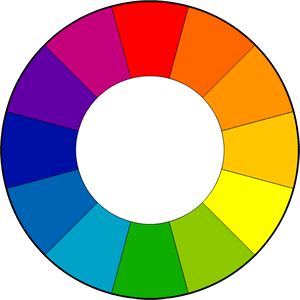
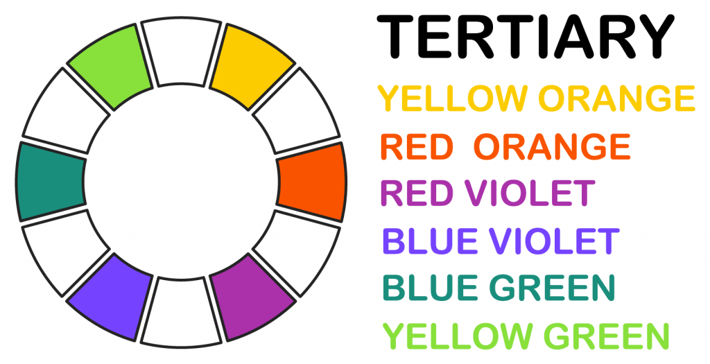
Using Primary and Secondary colour can allow you to experiment and find what suits best for your scene or photograph. The Primary colours are Blue, Red and yellow while the Secondary colours are Green, Violet and orange. As these are mainly the most used colours there are also tertiary colours that are made by combing a Primary colour with a Secondary colour. These colours can be a way to combine a scene together by allowing the surroundings affected to create a unique mood than what you would with maybe just using primary and secondary colours. These colours can consist of Yellow-Orange, Red-Orange, Blue-Violet, Blue-Green and Yellow-Green.
It’s not only Bright or Colourful colours that can provoke a emotion for a viewer it can also be caused by Neutral Colours. As well as the colour wheel the neutral tones can bring out a certain emotions when used in certain shots or scenes.
Black – Creates a feeling of Power, Formality and can be linked to death, evil and can be seen as menacing if used in the right setting.
Grey – Is seen as something modern or simple. It can often invoke a depressing or empty feeling towards the viewer as there is not much excitement in the tone.
Brown – Can be linked to dirt, wood and the earth. Giving a grounding feeling when viewed.
White – White can be seen as something that is pure, untouched and can be linked to being holy. If used in a scene it could capture the audience’s attention because of the way its colour can brighten up the whole room due to its bright nature when presented
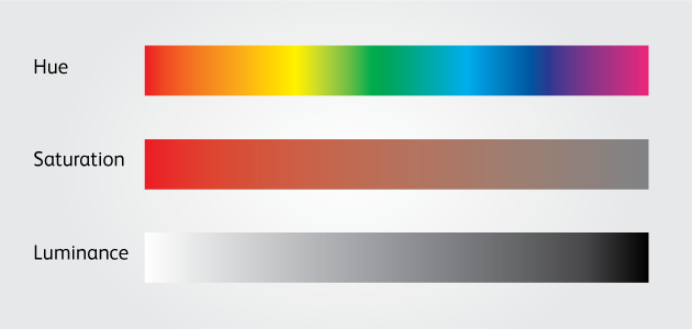
Saturation
Saturation is determined by the combination of the lights intensity, Having a high saturation on a colour will transform it into a brighter shade or tone. However the darker the saturation the darker the shades can go as presented above.
Luminance
Luminance is the measurement of how you describe the brightness of a colour. Usually it the Black is represented as 0% but where as white is represented as 100% due to its bright in colour nature and this can be called Relative Luminance as its defined as the relative brightness of any point in a colour.
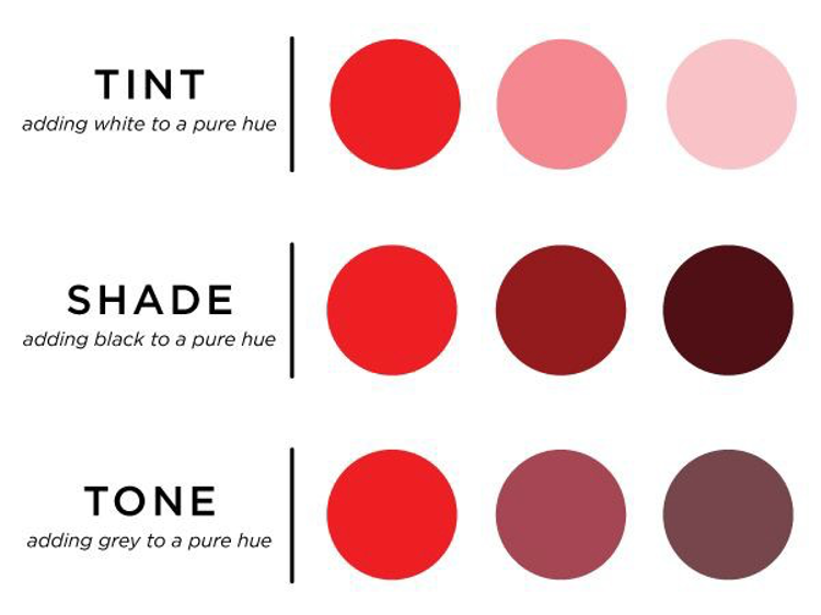
Tones shades and tints
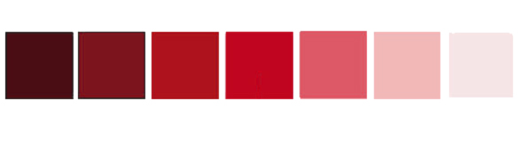
Tones – adding grey to mute a hue
Shades – adding black to darken a hue
Tints – adding white to lighten a hue
Different Colour Techniques:
Monochromatic – Tones, Shades and tints within a singe specific hue
Analogues – Using colours next to one another on the colour wheel
Split Complementary – Using colours that are opposite to one another
Triadic – Using colours equally spaced around the colour wheel
Tetradic – Four Colours evenly spaced around the colour wheel
Custom – Does not follow any set of rules or patterns on the colour wheel.
In this session we looked at the different type of sound and how they have progressed though-out history.
History Types of Recording
Mechanical – “A system of recording sound in which the shape of the medium is mechanically altered”
Magnetic – Sound waves vibrate the microphone diaphragm and is converted into a representation of the sound as magnetized areas on a plastic tape
Analog magnetic
Vinyl
Digital
Examples
Edoubard Leon Scott De Martinville’s (Mechanical) –
Created in 1857
A cone shaped horn which was turned on it axis with the sound wave recorded in a continuous line on the surface of the cylinder.
Vlademar Poulsen (Magnetic)
Created In 1898
A device which consists of a thin metal wire that helps transmit electrical signals over a wire laid between stations
Tape Recorder(Analog Magnetic)
Developed in the 1920s
As the earliest known magnetic audio recording was invented by Valdemar Poulsen research and development carried on throughout the world, and a new type of recorder was produced were the tape was instead coated with magnetic powder compared to the metal wire.
Peter Goldmak (Vinyl)
Created in 1948
The introduction of the worlds first long play record was a great development in audio recording as Peter was able to have a capacity of 21 minutes of audio each side. This also helped change the music industry as it allowed for longer recording and listening times.
Sony PCM-1 (Digital)
Developed in 1977
Although the first digital recording was publicly launched in Japan during the 60s a development made by Sony was the Sony PCM-1. For this invention you cannot credit one person but you have to credit the company as they were the first to distribute the recorder.
Types of Sound
Diegetic – we see it, we hear it
Non-diegetic – we hear it but we don’t see it
Music
Dialogue
Foley sound effects
Games/VR
Film, TV, Radio and Podcast
Non – linear
Linear
Interactive
Non – Interactive
Adaptive
Pre – determined
Music helps to create the emotional state of the player
Music reflects the emotional state of the on screen characters
Kinetic Interaction
Passive
Recording Sound
Omni-directional: A microphone that picks up sound in a circular way which means it is sensitive to sound from the front.
Bi-directional: A microphone that has a figure of 8 pick up pattern. This is good for recording voice of two people taking while facing one another.
Uni-directional: A microphone that is mainly sensitive to sounds that are coming from the front.
Rifle Mic(Hyper Cardioid): A microphone where the sound is mostly sensitive towards the front, used for film and video location sound recording
Sound Recorders and Mixers for Film and TV
DAT (digital audio tape)
Tascam
SQN mixer
Nagra Mixer
Post Sound Recording
Things to keep in mind in post production:
Levels : fade up and down to prevent popping at the beginning and of audio clips
Pan
Loudness
Equalisation (EQ)
Dynamic range
Mono: A single track to output sound to multiple speakers
Stereo: Uses multiple tracks to output different speakers
Post mixing Levels:
Max peak = -2db
Dialogue = -12db to -10db
Loud effects = -3db to -2db
Soundtrack or sore music must not compete with dialogue = -5db to -4db
On this day in 1906, engineer Peter Carl Goldmark was born. He was instrumental in developing the long-playing microgroove 33-1/3 rpm phonograph disc, the standard for incorporating multiple or lengthy recorded works on a single disc. https://t.co/y1HcMq2qJ2pic.twitter.com/Us3HxtbypE
we started looking at how lighting and cameras can have an effect on the way you see and connect with that’s is presented. we mainly looked at the different ways of formats can be used for moving images, framing with a moving image shots and also different moving camera techniques.
The first few things we specifically looked at was frames, frames are a still image that is played in a sequence at a high rate so that I can create an illusion of movement mainly used in video, film or television. There are different ways you can use this to your advantage such as creating time-lapsing and hyper-lapse.
Time-Lapse
Producing time-lapsing is a creative way to showcase a significant place or thing. The first time-lapse was developed and used in film by French illusionist George Melies who also helped lead in technological developments. But not only him Josh Nash Ott an American photographer who developed it for the use of motion cameras. From the discoveries by them two it has allowed the development to come to where it is today.
Looking at this example of a time-lapse you are able to see the changes throughout the environment, the time-lapse gives you a sense of being right there with them. This type of videography is a great way to capture landscapes and the world around you, it also allows you to see the environment in a different way that you would usually see.
Hyper-lapse
A hyper-lapse is pretty much the same as a time-lapse but the camera is moved in between frames to create a separated movement of a scene or environment. To create a good hyper-lapse it is importamt to keep it steady and to try not to disorientate your viewers.
With this hype lapse example they use the effect in a way to document their road journey. This type of method is great for videos such as travelling because it allows you to follow their travels in a short space of time rather than having to watch through hours of footage.
GIF and Cinemagraph
GIF stands for Graphic interchange format and was invented by Steve Wilhite a computer scientist who compressed image sequences that were popular online that allowed them to be shared with ease. with it having no audio people still can connect as it is a way to share jokes with others.
Cinemagraphs are a still photograph that has small amount of movement creating a video clip. through this process it can create a moving image. It was first mentioned in 2011 by Kevin Berg and Jamie Beck and this process allowed a way of creating a new style of work.
Mise-en-scene
Mise-en-scene comes from the French and translates to “The arrangement of scenery, props, lighting, and set design which means everything that is placed infant of the camera. The reason Mise-en-scene plays an important role in entertainment is because without all the elements that brings it all together, the scene could not have such an impact without the aspects that if all thought through then I would create a certain environment that could interact with the viewer best and present the scenes vision.
Key Factors
There are main factors that come into play when using the rules of Mise-en-scene. These are such as:
Set Design and Decor – The context in which the characters that are depicted fulfils many roles
Narrative – They situate the action and are meaningful. They can also establish genre.
Characterisation – The set can give you clues to the inhabitants character.
Symbolism – Elements of the set might be metaphors for themes explored in the work.
Characterisation is a good way to communicate the personality and profession just by the way they dress. From the audience’s view you can obtain a lot about who a character is, you can tell what kind of wealth they come from, also their morals and sometimes their intention.
Suspended Disbelief gives the context of what is going to happen or gives a idea of what’s about to go on by using the audiences attention and engaging their view at a object or something to get caught up in. This can create a narrative that is accepting by the audience.
Narrative can drive the story/act forwards and give the work and characters a more inclusive understanding from the viewers.
Acting
Acting is the best way to portray a character because If the actor can pull the vision off that the writers have perceived then It can help bring the narrative along. There are two different types of acting and those two are:
Method acting – Associated with the New York studios where their approach is to fully embody the character they are portraying. This could mean trying to stay In character for a full week or even until filming stops as this method can be seen as a really good way to become the character but although it can sometimes become too serious when actors don’t hold back off set.
Stylised Acting – This is where the actor use specific techniques so that they can align with what certain genre or type of acting they will be doing.
Different Lightings
A Image or Set can be profoundly effected by the intensity, direction and the quality of lighting so by initialising these can changed the way the image is perceived. By creating this you will have to use certain lighting techniques.
Key Lighting
Key lighting – This lighting one of the first and most used lighting an artist will use, this technique allows the subject to be in focus and gives shape to the Frame and object.
Low Key
Low key – This technique is used so that the subject has illumination in the back but while also keeping them in view. Using this it can create a sense of volume with a 3D feeling.
High Key – With this technique of lighting it can transform the set to appear brighter and softer than usual. It also doesn’t produce much shadows increasing the effect. In this scene it allows the characters to be the main source of focus as the surroundings such as the pink boxes creates a contrast with the actors outfits allowing the audience to interact and view them better.
Fill Lighting – Common in Television, stage and film this may be used to bring down contrast and allow the subject to be brought out more, also so that it can bring the dynamic elements to the scene. In this case the subject appears have a softer look but allows the viewer to still navigate who is in focus
Back Lighting
Back Lighting – This lighting technique allows a serious feeling to the scene and gives of the impression something is going to happen. With the lighting positioned behind the subject presents this setting by helping the narrative along.
Back and Fill Lighting – The purpose of this lighting is to fill in the shadows while also using back lighting to keep some shadows and keeping contrast.
Mixed Lighting
Mixed Lighting – Using more than one lighting can create a unique atmosphere by combining one another to allow certain shots and carrying the narrative like the photo I have shown.
Bounce Lighting – Using this technique allows a softer look to the scene by using a reflective surface to create this effect. This can add a mysterious feeling or can create a serious notion to the scene.
Over Lighting
This type of lighting set up allows a ray of light into or onto a subject to add a depth of field. this can also bring the viewer attention by only allowing the subject to have the spotlight
This is used to create a night time effect so that even if filming in day light you can create this technique and keep on going with out having to wait till night.
Throughout history there has been many ways to present or produce moving images or ways to use images to make them seem like they are moving. There have been a few ways that have been influential to this type of method such as:
Photography
Sequential Images
Synchronised sound
Some example of how precursors have helped in the history of the moving image such as:
Egypt – Rameses II in 1600 BC
Greece – Decorated pots
Dutch – Christian Huygens the Magic Lantern
Egypt – Rameses II
An example of when a moving image was introduced was back in the 1600 BC when Rameses II built a temple in which the columns were painted with a image of the goddess isis on all of the 110 columns, Each was differently painted from the next so that when a horse rider would ride past the images would look like they would be moving.
Greece – Decorated pots
From around 1000 – 700BC pots where use in all sorts of different manners such as art, projecting myths, plays and other uses. The way they set up their subjects is similar to moving images as they set there characters in almost stop like motion. But this is mostly known as a Sequential Sculpture.
Dutch – The Magic Lantern
Invented in the 1600’s Christiaan Huygens created the magic lantern, This was one of the earliest slide projectors and mainly used illuminated candles to operate. It was dubbed the magic lantern because when audiences saw devils and angels magically appear on the wall, it made them think it was real magic. By the 18th century it was a common form of entertainment.
Peter Mark Roget
In 1824 the persistence of vison was published by Peter Roget who was a theorist and claimed that “According to the theory of persistence of vision, the successions of a series of still images are made to make the appearance of motion”. His work towards stop motion was important to other pioneers. Not only was his work just theory he created a toy called the Thaumatrope which was very popular in the Victorian times. The toy was a disk or a card containing a picture on each side, then they would be attached to two pieces of string that you would then twirl quickly between your fingers and the two pictures would appear to produce a combination into single image.
Other Optical Devices
The Zoetrope
The Zeotrope is a several pre-film animation in which the device produces an illusion of motion just by being spun at a variable rate. This device focuses and depends on the humans retina and how fast an image can appear in decided time.
The Praxinoscope
Another toy like the Thaumatrope this was a toy from the 19th century and consisted a few thing such as a cylinder and a strip of paper that shows twelve frames. Compared to the Thaumatrope you do not have to twizzle it between your fingers.
English Pioneer Eadwead Muybridge
An English pioneer who was an important asset to the history of photographic studies in motion. Throughout his work he photographed over 100,000 images of things such as animals and people in motion.
In his attempts to capture motion he was asked to study the gaits of horses and to see if all four legs are off the ground, although he failed he went to experiment with faster shutter speeds. This led to him developing 12 cameras in which they were triggered using tripwires. This resulted in a series of Sequential images.
Etienne-Jules Marey: Chronophotographic gun
Etienne was known for developing the chronophotographic gun. This gun was made in 1882 and was able to capture 12 consecutive frames a second, all were captured on the same surface. The invention allowed him to study and capture animals such as insects to animals as big as horses.
This week we looked at assessing risk and how we are going to need to watch out for during this brief. if we do not follow or watch out for risks it could end up hurting the process and could potentially hurt someone if something is not properly assessed.
Reasons to asses risk:
TO IDENTIFY ANY POTENTIAL HARM THAT COULD COME TO OURSELVES OR OTHERS
TO HIGHLIGHT WHAT STEPS WE NEED TO TAKE TO REDUCE THE LIKELIHOOD OF INCIDENTS OCCURRING.
TO COMPLY WITH THE LAW
If we didn’t follow the rules on a production and something were to happen it could cause everything to be shut down and you could be prosecuted. As a team or individual, your are responsible for the running of your production. You will have to document all of the considerations to show that you have planned it.
Identifying Risks
There are three ways that can help remind on how to be safe and identify the risk before they happen:
Know as much about the production as possible
Never rely on just common sense
Keep in mind ‘Sod’s Law’ – if something can happen, sooner or later it will
Not only do you have to keep in mind what happens when directing a set but also to remember that there are people who are being paid or using their time for the production so you have to let them know where they are needed and when to arrive. It is not just time management you also need to plan so that you can ensure their safety during production.
Crucial Elements to the Production
Actors – They need to be told where you need them, how long will their time be taken up and also keeping in mind the safety elements.
Crew – Similar to the actors but with crew you have to let them know what you need and arrange times to better your time management.
Time of day – If you production is being used outside you will have to plan or adjust to the type of lighting. The time of day can also create an impact on your content, if you plan to shoot one day and you hope for sun but the weather changes last moment to a cloudy day it could disrupt the timing of the production.
Weather – Similar to the time of day if you hope to get a shot of a warm day/sunny day and the weather changes it can mess with your planning and the overall look on your content.
Location – this is one of the more crucial elements you will have to take into focus, the matter of location can change the dynamic of your content and you want to plan ahead by scouting the spots so that you are not met with any complications.
Equipment – before production you will need to figure out what kind of equipment you will need. With this you also have to keep in mind that you might need training with kit or have to check if you desired items are available.
Risk – lastly this is the most important one when it comes to production. Risk has to be thought out and be factored into everything you do.
The development of photography has expanded throughout the years, developing from the camera Obscura to todays modern cameras. In this post it will explain how the camera came into history and how it has developed throughout history.
Camera Obscura
The start of the invention was just a box which would allow a sliver of light into a hole and then it would project the image on the other side but would be inverted.
At this time there wasn’t much to it than inverted images but if we fast-forward to the 1800s the oldest surviving photograph, it was believed to be the first captured by Joseph Nicephore Niepce. He produced this by a technique called Heliography which would include the process of coating a surface with zinc, copper or another salutation and this would then become exposed to light and produce a positive image or a negative image.
Heliography Method
With this technique there could be no retakes or redo’s as it was a one shot method. Using this would make you think more about what shot you are taking and how it would come out, resulting in you being more careful than you would with a modern camera.
First Human photographed
Shot in 1838 by Louis Daguerre was the first photograph to include a recognizable person. Because of the long exposure times the camera could not include every person but according to News18 when the photo was finely grained more of the photo was exposed as a child’s face appeared in the window as well as less distinct figures.
Kodak Camera
Created in 1888 by George Eastman the kodak camera was a metal box which was loaded with 100-exposure film, this was a more refined version of the Heliography process. Although the same rules apply with the exposure film only being able to capture one image at a time while the Kodak camera allowed you to take multiple images on a single roll of film. The only expense was if you you mess up or destroy the roll of film you would not be able to get them images back.
Camera, box. Kodak #1. PG*0169.
Not only was it the invention of the film rolls it was also the fact that when you were finished with your roll of film you could then send it off to a factory where they would then reload it and process the roll. This helped with development of the camera as more people could see that they could also use it the selves without going through any prior training before, this helped coin the phrase “You press the button; We do the rest”. This helped with commercializing the camera making it seem accessible and easy to use.
Land Camera
Now to the 1940’s the first Land Camera was brought out, it was the first instant camera. This camera was the development of a perfected vison of all the cameras before it. Known as a Polaroid, the camera would help revolutionize the world of photographic imagery by using the traditional darkroom process and using film to produce a photograph that would print out in moments notice.
The invention gained a lot of attention while also leading in the race of technology in cameras. The component of being able to shoot a image in a matter of minutes allowed this device to be use in ww2 as it helped navigate and take images for reconnaissance during missions or battles. This gave an advantage over the enemy as they could record what happened or what the objective area contained.
First Digital Kodak Camera
Going back to the Kodak company in 1975, Steve Sasson produced the first digital camera where he used old parts of camera kits that were left over from around the factory. The camera’s size was built a fairly big size, but it was a revolutionary creation and toom 23 seconds to capture a single image. Although it was a great leap in technology the camera still only shot in black and white.
Kodak DCS-100
The next digital camera that was created by kodak was the 1991 Kodak DCS-100 which used a Kodak system but was also using a modified Nikon F3 film chamber while also the user would need to have data storage unit that would be connect by a shoulder strap and connected by a cable. This helped push the idea of having cameras accessible and trying to define it by making it more traversable.
After years of refinement and development in photography we come to the modern day camera the DLSR. The DLSR combines the technology of film and digital into one device, what it different from all the pervious cameras is that this allows you to view the perspective of the photo you are about to take and also allows you to review that image straight after you have taken it. This is a big change in what we have seen previously, with the limitation of the old technology there is a big advantage towards using a DLSR. However although these new options and ways to better capture an image, there are cons to using this camera. An issue or possibly a problem that could come up is when trying to shoot in a film style fashion or trying to replicate the forms of formats, the issue is that the modern camera cannot get the same contrast or details that most film cameras can capture.
Although there are pros and cons to what type of camera you choose to use, I can say that the evolution of the camera has come a long way. You can see this by the accessibility that is present when using modern cameras as you are usually able to snap a shot on the go.
Starting this brief we were tasked to create a series of photographic images which should present the iconic landmarks that are in and around Worcester. These photographs should show building and places that have connections to the town or the university. With this I am going to aim to produce photos that can be easily identified. The end game is to have photographs that I can contribute to the calendar.
Brief
Mind Map
Creating a mind map will help me get a better idea on how I will approach this brief, We were given six photograph objectives which included:
A Landmark
A Person or People
A ‘Consumable’
An Event
Own choice
Out of these tasks I will write down a few ideas on where I could possibly take them.
Idea Reasoning
Landmark
Starting with a landmark my first thoughts were the Cathedral as it is seen as a iconic landmark that blows you away at first sight, as this is a very popular idea I will try to take it on and produce my own photo that will try give a different perspective to a beautiful landmark.
Another idea for a landmark would be the Sabrina bridge or the Worcester bridge. These two to me are a landmark because everyday people use it and to me it adds a unique style to the city. Not only does it let people cross and go on their daily lives it is something to visit and have a look at.
3. My third and last idea for my landmark objective is to photograph the Worcester Hive Library, this is also what I would say is another iconic landmark because of the use and appearance it gives to the people. The Hive has a simple yet complex look, it give this feeling that it is almost out of place but yet it adds to the personality to the city.
Person/People
For this objective a two ideas came to mind, one idea is to show the produce a photo of people going on about their day. This will give the sense of what kind of people are around Worcester. This could work well with the calendar because it allows the viewers to understand the city better.
The second idea is to take photos of people shopping, this would help to get an idea of what kind of shops there is and also how people are shopping. Meaning, what kind of people shop where and also is the shops worth visiting.
Consumable
Similar to my idea before with presenting people shopping, I am going to shoot shots of just the shops. Hopefully trying to get people out view so I can show that the focus is only on the business.
As I am going to be showing the types of shops and consumable places an idea is that I could shoot small owned businesses to help support them or I could focus on the bigger shops but to me that does not give off the best impression Worcester has to offer.
Event
Now due to the Covid pandemic it has been hard for organisers and such to host events. But as this is a ‘if possible’ task i thought i might as well add a few ideas as if everything was still on. My first idea would be using the area taking photos of games or events but as this is not possible I might just present the front of the arena to symbolise that something could be going on.
Another idea would be to use the festivals that would have taken place. The idea would be taking photos of the people and grounds it would have been used on. If it was a fair I could have used the rides along with students or people to show what events are like in Worcester.
Own Choice
For this objective one of my ideas is to shoot the architecture of Worcester, this would be either in the heart of the town or the housing. This would help any viewer to get an idea of what kind of style and atmosphere you could expect if you visit.
As I have already got a few ideas for my landmarks and can only choose one, an idea is to take a photo of the entrance of the university or around it. To me this is a landmark but also a place to learn and explore new things. So using this in the calendar would allow visitors to already know what to look for if visiting the university.
Research
Pinterest
Looking through Pinterest I wanted to find what others peoples take on Worcester is, some of these photos have given me an insight and some inspiration on these locations I have found and the ones that I have been before. I have had a few thoughts on how I could present my take on these landmarks and such.
Photographer Inspiration
Phil Penman
While gathering ideas I wanted to take a look at some photographers that could help me expand my ideas and give me some inspiration into what I could implement into my own work.
Searching across Pinterest I came across Phil Penman who is a street photographer based in New York. He uses film cameras to captures daily life and the world around him to express his artistic voice. I found inspiration from him due to the way he uses simplicity and the life around him to produce gritty yet beautiful pieces of work. Because he mainly uses film he is able to connect contrast and perspective to bring out details and things you might not have taken into account with a modern camera. His work helps fully emerge the viewer into his work and connect more than you would normally.
Alketa Misja
Genoa seen from Museo del Mare, alketamisja photography 2016
Another Photographer I have found is Alketa Misja who is a architect/planner and photographer from Albania. She is known for exploring the world of architecture, because of her field of work she has been able to visit and photograph different buildings around the world. What stood out to me was her work with photography, she uses her love for building and the historical important and presents them in a way that honours the art work of the building details. I found the way she uses simplicity with the buildings as a good way to represent the landmarks or historical sites to their worth.
I think I will use Alketa Misja’s way of work to help me bring out the beauty in landmarks and urban buildings.
Target Audience
As this Calendar is to represent Worcester i want to aim and focus on reaching the younger ages such as the ones who are thinking of going university but also a older generation where they want to explore what the city has to offer. The landmarks and shopping areas should help me put my point across.
Planning and Shooting
My main plan for this task is going to be the focus on walking around Worcester and seeing what catches my eye the most. With my objectives such as shooting landmarks, people, events and etc I am going to try and provide a good perspective so that when someone looks at the photo they can tell it is from Worcester and hopefully give them some sense of what it is like in and around the town.
I first wanted to start off my walking around and getting some quick shots to see how the photos and perspectives will work. This will help me get a better sense of how my photos will connect with the viewer and produce work that allows easy acknowledgement.
Shots
First shoot
Shots Review
For my first walk around I tried to focus on the buildings around town, mainly the ones that stick out the most. On this walk I first travelled to the racecourse track to try and see what kind of perspective I can capture from there, what I discovered was that you can spot the cathedral, the hive and another tower point. As you can see this from the race track it gives a sense of how close you are to the city and the feeling that you are a close distance.
Due to the weather it was tuff for me to get a good setting for my photos, although the grey weather is pretty much all we get most of the time, a better weather setting would be better to represent Worcester because it allows all the aspects of the city such as the people and environment will protrude more.
To me the photo I have taken are a mix of landmarks and consumables because during the pandemic I am unable to get the right time and settings to truly photograph my perspective. The consumable shot I tried to shoot an alley that consisted of small shops, mainly small own business which I would say presents what Worcester consists of.
Hive
Shots Review
After walking thought the town I wanted to shoot the hive, As it was the first walk about I forgot that I should be shooting in landscape so that is works best for the calendar, although I shot portrait I believe a few of these shots are still useable by doing a bit of editing. What I found to be one of my bigger problems was the weather, to me it did not allow the full extent of what the city can be like during summer and with a bit more life in it. You could also say the same for the pandemic as it has hit hard with the amount of people out and about.
What I like about this shot is that although it is portrait I have been able to capture the hive in a positive perspective and able to get a unique look at how the building stands between the rest of the architecture.
Out of the photos I shot I took them into photoshop to see if could convert them into landscape photos, In expectation I didn’t think I would be able to get the same outcome or perspective but I think that although not all is in shot the presentation of the hive still allows it to give of the architectures style.
With the photos I have taken out of the four the second one to me is the best outcome, I think this because between the rest of the shots this one allows the perspective to still be clear and that this one does not have as much clutter compared to the others. This is because there are no cars showing which to me creates too many distractions and this takes your eyes away from the main idea.
Second Shoots
Shots Review
For my second shoot I was lucky enough to get a better day with sun coming though for me. On this day I was able to get some better shots that hopefully bring the idea of Worcester together more. The idea for this shoot was to try and get more of the town and the things surrounding. In these shots you can see I started off at the bridge where I took photos of the cathedral, because it was a sunny day it has allowed me to capture it in a more scenic view rather than being a dull grey day.
After shooting the cathedral I walked towards the centre where I was looking for a consumable and person shots. Because of the pandemic it has been hard to capture a person shot so I plan to use one of these shots such as the road of shops and restaurants to present the idea of people using them. Although they can also be used a consumable shot it can also represent a people shot because they are used everyday if I wasn’t for the pandemic.
Edits and Chosen ideas
Having gone though my shots I have chosen to edit the best ones that I thought worked well with my criteria. With these photos I have not done much changes to the photos them selves as I believe that I should leave it to as little changes as I can so you can see the real side of Worcester rather than all touched up and edited.
Landmark
At first when thinking of a landmark this idea instantly came to mind, although it is a popular choice that probably everyone else has done I wanted to try my self and to see if I could get my own perspective. One of the main reasons I have chosen this landmark rather than the Hive or another known location is because it is the the most iconic landmark in Worcester. It is so well known that if you have even visited once you would have come across this and would instantly know where it is if you were to show a photo.
Before this photo was taken I has already photographed this location but however that photo was on a rather dull day, if I had chosen that image I believe that the impact that I would have had compared to this one wouldn’t have been that great because on a calendar you wouldn’t want to see a dull boring place where as if it was sunny and people are walking about it would give you a better reason to visit or have a look into what Worcester has to offer.
BeforeAnd After
Realising now that looking at the before and after I can see that I have turned the brightness of the sky too blue, the reason behind this is because when I was editing I added too much dehazing which increased the temperature of the sky to be more blue than I expected. I have not made many changes because I want to keep the realism within the photos so that when someone comes to see the these locations they wont be under surprised or feel lied to.
Edited
After looking at the before and after I have changed the dehazing so that it does not have a too much of an effect on the sky but also the building, I also noticed that it was making the cathedral too brown and dark so by adjusting the de hazing it has allowed the areas to have a better quality.
Overall I am happy with this final image for my landmark objective because to me I have achieved what I wanted by producing a perspective where it looks like a good place to visit but also to show off the architecture and the history Worcester has to offer.
People / Person
This objective was a difficult one for me because as it was lockdown there was not many people about doing their daily tasks or even living as normal. With this I did not think that I would be able to produce a photo that would fully represent the idea of the kind of people in Worcester. So after realising this I thought that I could photograph the places that people would be or to try and shoot people around the shops. This would hopefully produce the perspective of the type of people who live in Worcester.
The reason I thought that this photo worked best was because the way I was able to get the type of shops / buildings with the some people in frame, with the people in the bottom right and the framing of the town allows the viewer to get a sense of what kid of people are in Worcester but also the kind of shops there are. Although this was focused on the people this could also be seen as a consumable because of the way it is showing of the range of shops and restaurants such as the slug and lettuce.
Although I found this as my best person image I know that I could have approached this better by getting a better perspective of just the people walking about or going on with the daily lives. which in my case I have not been able to fully achieve.
lastly In whole with this objective I don’t think I have done as well as I could have, but after shooting and editing I have realised my mistakes and the paths I could have done better.
Consumable
Coming to the consumable objective I came across the same difficulty’s with the people/persons task where because of the pandemic it has been hard for people to go out and experience shopping and other forms of consumerism. Because of the lack of the activity and the shops being mostly closed I have decided to shoot as if there were people there.
When I was taking this photo I kept in mind the idea that I wanted to shoot as if there were someone there or people sitting at tables using the shops or restaurants. This would help get a sense of what it would be like if the pandemic would not have happened.
Choosing the image I wanted to use, I chose this image because with this one not only does it follow my idea of acting as if there were people there but also what kind of place Worcester is such as the buildings and aesthetic the town holds. Not only that but if you were to see this image in the calendar you would see the layout and style the city has to offer, giving a reason to visit due to its unique style.
Event
Thinking of a place to shoot for my event I first thought of the arena because it is a well known location that you could also say is a landmark because of its use by the university and its sports teams. Although the area is well known and more or less a lot of other people will chose this idea I thought that I could do something else such as the race course. My idea for the race course was because to me it seems as landmark but also a an event place where people will come to watch the races or even just to walk around when there are not races on.
Because this was apart of my first shoot the weather setting was not in my favour but I thought that although it was not ideal I was able to get the perspective I wanted. What I was aiming for was to get the whole of the race course in frame but as I came to shoot the shot the idea did not work as well as I thought it would due to the vast size of the course. However because I could not get what I had envisioned I had another idea where I could get a shot of the course while also getting the town in. This idea sort of worked in my favour as I was able to get apart of hive, the cathedral and also the race course stands on the right side.
Compared my other test shots they did not work out as well as the perspective and what I was aiming for with targeted subjects within my frame the others did not turn out as good.
When looking at the differences the problem with the other shots are that compared to my chosen image these did not reach my required ideas such as not having the stands in frame and also focusing too much on the landmarks in the background. With these shots I felt that there was to many distractions when the shot was zoomed in or zoomed too far out.
In the end I thought that I was able to achieve what I wanted although the weather conditions could have been better to portray my perspective the layout and framing I thought worked well. When looking back I realise that weather conditions are a big part in how your images turn out but also how it can have an effect on the mood.
My Own choice
Lastly for my own choice I have decided to choose the Hive for my final image. The reason I have chose the hive is because of a few different reasons, the first is that to me although it is not the greatest looking building the design and architecture of it gives more life to Worcester and also adds to the aesthetic of the town. Which to me Worcester is a city with a range of different designs and styles thought out the town.
Another reason I have chosen the Hive is because the use it has to the city and the students. The Hive allows people to come in and learn or lookup what they need for their studies. To me this is a big part of Worcester as it gives it more character but also the use it gives to the city and the people who live in Worcester.
Coming to shoot the Hive, on the first shoot the weather was not the best as it was cloudy and dull. This was probably not the best idea or setting to shoot in but however the whites and shadows that were produced of the building worked in my favour as it brought out the colour without too much over exposure. Not only that I think that If it was a bright sunny day the contrast the gold and brown mixed with a blue sky could distract you from the main subject which is the Hive.
These four photos are best format layouts I could produce and that I thought worked well. What I found when deciding which one works best for presenting the Hive is that when I cropped it too low exposing the streets and cars, the eyes become distracted by the garage or people which is what I did not want.
After coming to the conclusion of choosing the last image I started to lookout for any other distractions there were on the image. What I found was that the metal pole was a big distraction as when you would look at the bridge or that side of the image it would take you away from the main point of view.
Coming to an end I thought that this one is the my best one if not could be with a few changes because the perspective and the way I was able to frame the Hive in a way that it mainly focuses on the the building it self but could have been improved by a better weather condition or more subjects in frame such as people or students.